Told you I'm long winded, Jane! You tired yet? LOL

Told you I'm long winded, Jane! You tired yet? LOL
| 15) OK, now we have all our basic shapes done, we can line
them up correctly. Make sure your colored line is at the top of your
base, with the triangle sitting on the top of the line and the half ellipse
on the little square at the top of the triangle. Go to 'layers/merge/merge
visible'.
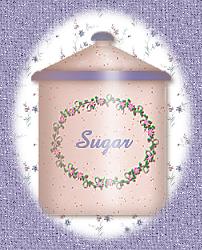
16) Now we'll do the highlights and shadows. First, you'll notice that the drop shadow that we put on the blue line at the top of the base extends a little outside the base. To get rid of that, click on the part that's outside the main shape with the magic wand, and go to 'edit/clear'. This gives us a nice clean line to work with for the shadows. 17) Add a new layer. Using the same color you used for the drop shadow on the colored line, and the line tool set to single line, stroked, width 10, antialias checked, all others UNchecked, start under right side of the colored handle on the lid, and following the angle of the lid to the left, draw a line to about one third in from the top left side of the colored band. Continue straight down to the bottom of the base. 18) Go to 'image/blur', and set it to about 12. Click OK 19) Add a new layer. Set your color to white, and using the line tool, draw another line just slightly to the right of the center of your image, starting under the lid handle and following the angle of the lid. Continue the line straight down from the colored band to the bottom of the base. 20) Go to 'image/blur', and set it to about 7. Click OK 21) Almost done! Go to your layers palette, and click on the merged layer, the one that holds your base image, to make it the active layer. 22) Using the magic wand, click outside the image to select the blank spaces, then go to 'selections/invert', to select your base image. 23) Do not deselect. Add a new layer then go to 'image/effects/cutout'. Set the color to the same color you used for your other shadows, opacity 36, blur 23, vertical offset 0, horizontal offset 15. Click on OK. 24) Do not deselect. Add another layer, then do another cutout with the same settings, except change the horizontal offset to minus 10. Click on OK. 25) This takes care of the shadows and highlights, so now you can merge layers. Go to your layers palette and make the layer with your base image on it invisible by clicking on the glasses. 26) Now go to 'layers/merge/merge visible' to merge the layers with the shadows. You should now have two layers in your layers palette...one with the shadows on top, and one with the basic image underneath. 27) Click on the basic image layer to make it active. Open the image you've chosen to use for decoration, and go to 'edit/copy'. 28) Make your canister image active and go to 'copy/paste/paste as new layer' and move your decoration into place on your canister. 29) Add another layer, and type in whatever text you'd like, such as 'sugar', 'flour', or whatever. 30) Click on your layer palette. You now have 4 layers. The one at the bottom with your basic image, the second one with the decoration, the third with the text, and the top with the shadows. 31) Make the text and shadow layers invisible by clicking on
the glasses. Go to 'layers/merge/merge visible' to merge the decoration
with the canister image. This way, you can use the same basic image
and just change the text layer for other canisters. To make the smaller
size, resize only the height and leave the width the same as the original.
 I hope this is OK. I probably over explained things, but it's
difficult to guage
|